Dishonesty can take many forms. Many are easy to spot, or at least will get caught out by a little research – or by the increasingly large number of journalists and organizations focused on fact-checking. Other forms are subtler. My “favorite” with respect to numerical information is cherry-picking – using only a few carefully selected facts to support or refute an argument. The facts cited are usually correct, and the presenter might be well-intentioned, but the approach is intellectually dishonest. Here’s an example, a Washington Post letter to the editor, in response to an op-ed column written just after the San Bernardino shootings:
“In his Dec. 4 op-ed, “Mass shootings all share one link,” Eugene Robinson argued that the United States has more gun homicides than other countries because it is easy for Americans to purchase firearms. I agree that gun ownership matters, but this can hardly be the sole explanation.

Wyoming has the highest gun-ownership rate in the nation, yet its number of gun murders per capita is lower than Israel’s. Vermont, North Dakota and Idaho are other states with easy and widespread access to firearms, but the homicide-by-gun rate in Vermont is lower than in Italy. In North Dakota, the rate is on par with that of Taiwan; and in Idaho, it is substantially below the rate in Macedonia.”
The author states his case clearly enough in the first paragraph, but the second paragraph descends into meaningless comparisons. Do you have any idea how significant an issue gun violence is in Israel? In Italy? Taiwan? Macedonia? (OK, perhaps Macedonia is considered “the Idaho of the Balkans.”)
Regardless of the writer’s intention, I’m left with the strong impression that the writer is trying to slip something past me. And even if we don’t question the letter writer’s integrity, it troubles me that The Washington Post published this particular letter. Given the large number of thoughtful people on all sides of this issue, I’m left wondering if The Post chose to use this letter in order to make one side look bad.
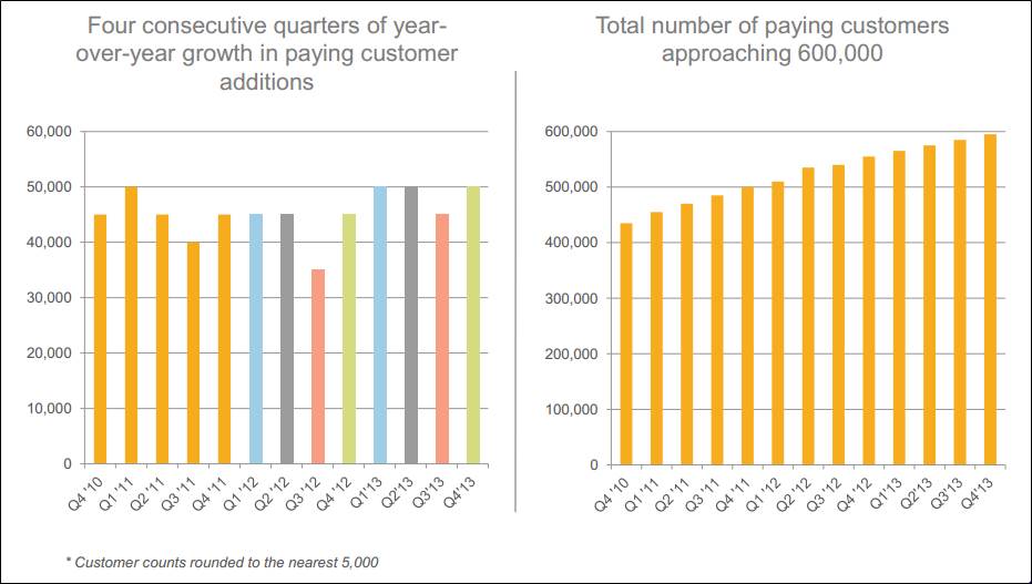
The practice of cherry-picking is pervasive. Here’s an example in

The left-hand graph has cherry-picked information in at least three ways. Can you identify them? (See the original blog for that discussion.) Moreover, to make things even worse, the graph on the right gives us a clue to the information we might most want from this presentation – i.e., new customers each quarter – but only a clue, since the scale is too small to get that information with any precision. Since a quick glance seems to suggest that new customer acquisitions are leveling off, one begins to form dark conclusions about just why the company chose to present information in this way, especially when presented adjacent to the cherry-picked data shown in the graph on the left.
So be careful when you’re presenting a limited amount of data when loads of data exist on the subject. Even if your intentions are good and true and honorable, some may question your integrity. Or your intellect, or your diligence. And don’t even get me started on the cherry-picking we’re having to endure from the many candidates for high elected office.
“Painting with Numbers” is my effort to get people to focus on making numbers understandable. I welcome your feedback and your favorite examples.

