It’s that time of year again! Our thoughts turn to the College Football Playoff picture, and for many of us, figuring out our best health insurance alternative in the face of wildly gyrating prices and complex competing plans. If you’re a finance professional, you’ll be doing your coworkers and your friends a huge favor if you can help them through this important and expensive decision. And data visualization plays a big part in this task.
Suppose you’ve gone to the appropriate websites and identified your insurance alternatives. This simple table summarizes the key features of each one:

Plans 1 and 2 are generally similar, with Plan 2 offering a lower deductible at a higher premium. Plan 3 has lower deductible, lower out-of-pocket maximum, and a lower coinsurance rate, but a significantly higher premium. Plan 4 is an unusual one: you pay 100% of your medical expenses up to $5,000, and none after the first $5,000.
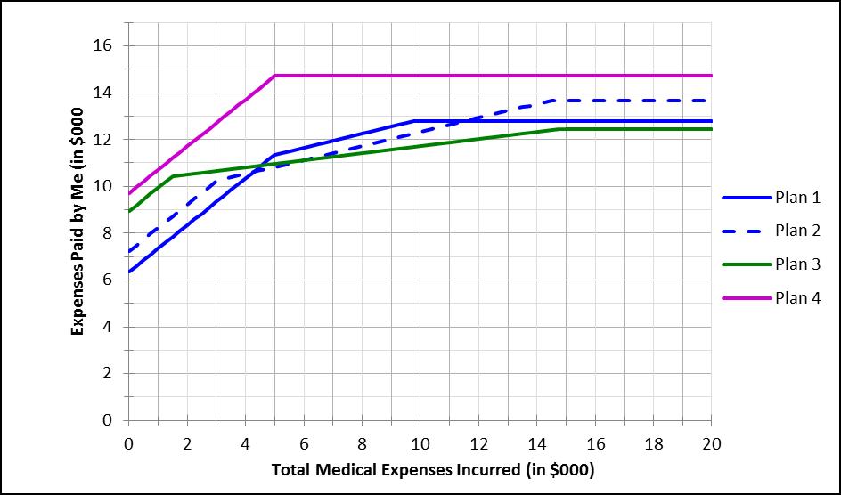
How should you decide between these plans? One way is to build a simple model that calculates your own total payments across the full range of possible total billed medical expenses. A graph of that model, for each of the four plans, for total billed expenses between $0 and $20,000, would look like this:

You’d probably reject Plan 4, since your total payments – including both premiums and coinsurance – are higher at all levels of total billed medical expenses. For the other three plans, the least expensive choice depends on how large a medical bill you run up. But at least now you can make a reasoned choice, based on your best guess of what your total billed medical expenses are likely to be. Now, which plan would you choose?
(Of course, the health insurance decision can be very complicated, and there are other things to consider besides the pure financials. I discuss other considerations in a separate post – click here to see that one.)
“Painting with Numbers” is my effort to get people to focus on making numbers understandable. I welcome your feedback and your favorite examples.

